Scatter chart in Power BI is used to display the relationship between two measures.
To create a scatter chart, you place measures of X-axis and Y-Axis.
It uses bubbles/circles or any other available shapes to represent the values of the measures.
A dimension can also be used to analyze measures over different categories.
In this blog, we will see how to create a Scatter chart to display relationship between Profit and Quantity over different subcategories.
How to create a Scatter Chart in Power BI
- Launch Power BI desktop and connect to an Orders table. This table contains Sales data and have fields like OrderID, OrderDate, Profit, Quantity ,Subcategory etc. Connecting to excel datasource
- Navigate to Report view and from the Visualizations select Scatter chart. This will create a place holder of the scatter chart. To create a scatter chart, you will place fields in the X-axis, Y-axis, Details, Legend etc.

3. From the Fields on the right, place Profit on the X-Axis, Quantity on the Y-Axis. This is give you just one bubble as it is displaying the relationship between the measures for the entire data set.
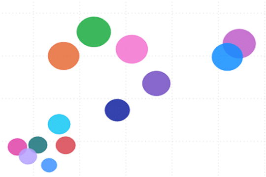
4. Place Sub- Category on the Details. You will get more bubbles now corresponding to the different Sub-category. But all the bubbles will be of the same color.
5. To get bubbles of different colors based on the Subcategories, place Sub-Category on the Legend. This will display bubbles in different colors.
6. Now we will set the size of the bubble based on the number of Orders. To achieve this, place OrderID on the Size.
7. All the field settings will look like

This will create a Scatter chart

The tooltip will display the values for Sub-Category, Profit, Quantity and the bubble size.